Supergraphics
Total Design
Wim Crouwel
Unit editions
2.28.2013
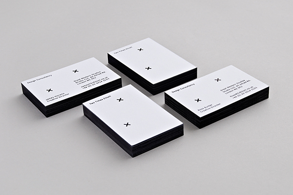
Two Times Elliot
Knockout Font Specimen
Publication
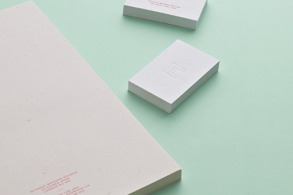
Daniel Hopwood
Identity
Aspect photography
Identity
Studio Stationary
Two Times Elliot
Publication
Daniel Hopwood
Identity
Aspect photography
Identity
Studio Stationary
Two Times Elliot
2.25.2013
Hunt&Co
Hunt&co
Published by Process
Promotional cards
Promotional cards for process journal based around the collection of four cards to receive a free copy of process journal. Really interesting use of cropping and the cards placed together creating the whole image whilst still working separately. Like the re-working of a common phrase to make it relevant to the process promotion.
Published by Process
Edition 2 poster
Additional poster for process journal addition 2 that is delivered with the publication as a slip cover that gradually unfolds to uncover the simple and bold typographic layout of the poster. Uses a typeface that is distinctive in a manor that may only appeal to creatives or typographers which is aimed nicely at the magazines audience.
Solunite
identity and packaging
Identity system and versatile packaging for stationary for Solunite architectural flooring company. The packaging works nicely to hold any of the companies stationary items in a number of combinations, giving the idea of each package being specific to the client. Simplicity of the identity allows for the images used and the actual product to take precedence over the design.
K.W.Doggett Fine Paper
Promotional flyer
Hunt&Co
Published by Process
Promotional cards
Promotional cards for process journal based around the collection of four cards to receive a free copy of process journal. Really interesting use of cropping and the cards placed together creating the whole image whilst still working separately. Like the re-working of a common phrase to make it relevant to the process promotion.
Published by Process
Edition 2 poster
Additional poster for process journal addition 2 that is delivered with the publication as a slip cover that gradually unfolds to uncover the simple and bold typographic layout of the poster. Uses a typeface that is distinctive in a manor that may only appeal to creatives or typographers which is aimed nicely at the magazines audience.
Solunite
identity and packaging
Identity system and versatile packaging for stationary for Solunite architectural flooring company. The packaging works nicely to hold any of the companies stationary items in a number of combinations, giving the idea of each package being specific to the client. Simplicity of the identity allows for the images used and the actual product to take precedence over the design.
K.W.Doggett Fine Paper
Promotional flyer
Hunt&Co
Subscribe to:
Comments (Atom)


