Showing posts with label Brief 5 - Context. Show all posts
5.24.2013
Project Projects
Website by Project Projects for a research initiative into the study of motion. Think an aesthetic similar to this could work for the carriageworks website in order to establish it as an alternative theatre venue in Leeds.
5.18.2013
Hottinger Retirement Facility
Aline Dallo, Julia Kind,
Kathrin Urban & Tina Stäheli.
Wayfinding
Wayfinding for a retirement home using frames as a way of changing the feel of the signage. Good reference point for the Sound Bites signage as it makes use of a similar modular style to how I was thinking of doing the signage.
Graphic ambient
Aline Dallo, Julia Kind,
Kathrin Urban & Tina Stäheli.
Wayfinding
Wayfinding for a retirement home using frames as a way of changing the feel of the signage. Good reference point for the Sound Bites signage as it makes use of a similar modular style to how I was thinking of doing the signage.
Graphic ambient
Kalmar Konstmuseum identity
Nille Svensson
Kalmar Konstmuseum
Wayfinding
Identity for Kalmar Konstmuseum in Sweden. Really clever graphic system running throughout with the shape of the logo working as a backdrop for the type and wayfinding material. Something worth considering for the sound bites and carriage works wayfinding.
Graphic ambient
Kalmar Konstmuseum
Wayfinding
Identity for Kalmar Konstmuseum in Sweden. Really clever graphic system running throughout with the shape of the logo working as a backdrop for the type and wayfinding material. Something worth considering for the sound bites and carriage works wayfinding.
Graphic ambient
5.10.2013
OK-RM
OK-RM
Gasworks
identity
Some really nice identity work by OK-Rm that I think is particularly relevant to the Carriageworks identity brief with this being for a similar venue and also in a similar vane. I think the consistency gained by having the information down the edges of each page and running across the stationary in the same way is something I'd like to implement on the Carriageworks branding.
Gasworks
identity
Some really nice identity work by OK-Rm that I think is particularly relevant to the Carriageworks identity brief with this being for a similar venue and also in a similar vane. I think the consistency gained by having the information down the edges of each page and running across the stationary in the same way is something I'd like to implement on the Carriageworks branding.
4.22.2013
3.19.2013
3.07.2013
Brief 5 - Carriage works
I went down to Carriage works today whilst I was at Vernon street to take some pictures and see what their current branding is like in terms of way finding and signage in the actual venue. Surprisingly it isn't that bad, however there are a few issues with consistency, as well as issues I have with the reasons behind some elements in the branding. Mostly the reason for choosing to use a different typeface than the really striking type used down the side of the exterior of the building, which would have worked really well within the identity, my initial ideas used a very similar (if not the same) font.
Unfortunately, I was fairly promptly stopped from taking photos and told to return tomorrow, when they would be able to get proper permission from a manager.
3.05.2013
Studio Makgill (again)
Boxpark
Identity & collateral
Identity by Studio Makgill for Boxpark, a pop up mall made using metal storage containers. The identity is based on the 'monolithic' nature of storage containers and is used only in monochrome. Word marque translates really well across print and wayfinding, I am aiming for something like this for the carriage works rebrand.
Studio Makgill
Identity & collateral
Identity by Studio Makgill for Boxpark, a pop up mall made using metal storage containers. The identity is based on the 'monolithic' nature of storage containers and is used only in monochrome. Word marque translates really well across print and wayfinding, I am aiming for something like this for the carriage works rebrand.
Studio Makgill
2.28.2013
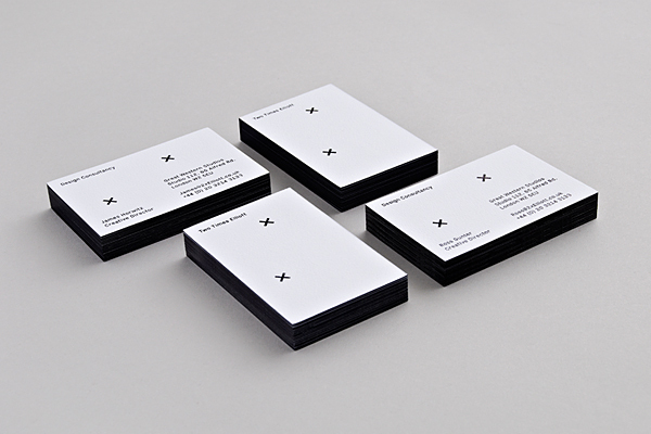
Two Times Elliot
Knockout Font Specimen
Publication
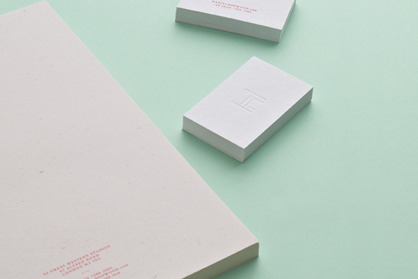
Daniel Hopwood
Identity
Aspect photography
Identity
Studio Stationary
Two Times Elliot
Publication
Daniel Hopwood
Identity
Aspect photography
Identity
Studio Stationary
Two Times Elliot
Subscribe to:
Posts (Atom)