
Showing posts with label Brief 2 - Ben Harris. Show all posts
Showing posts with label Brief 2 - Ben Harris. Show all posts
5.29.2013
5.27.2013
Brief 2 - Ben Harris Web mock ups


Web mock ups for Ben's site which is a working site...just shows how it will appear on screen and how each element is sized. Website purpose, as was the intention with the whole identity was to keep imagery as large as possible. The first page is the home page, which presents a full screen slideshow of Ben's images. The second example is the portfolio page, showing large thumbnail images which then link to the relevant project when clicked.
Link to Ben's site.
5.17.2013
Brief 2 - Ben Harris - Double sided printing...


Printing Bens photobook brought about a number of issues that I never encountered on the lazer printer due to the double siding process not being a manual one. However When I printed the book on the inkjet printers, the registration of the double sided prints was much less accurate, meaning that when I trimmed the book, a lot of the page was lost. This meant some information was uncomfortably close to the edge of the page, if not cut off. I have had to alter the design in order to account for a much larger trimming area.
5.16.2013
Brief 2 - Ben Harris printed stationary


Printed stationary for Ben Harris identity on Arjo Wiggins recycled paper. I particularly like that there is a bit of show through on this when held up to the light, which allows you to see both the details of the flecks in the paper and the mark on the back of the page.
5.14.2013
Brief 2 - Ben Harris website updates
http://bpmharrisphotography.co.uk
Updates to Bens site including streamlining of images, both file size so that the site runs faster and the amount of images on display. This means that Ben had to be more selective and put only the best shots up, which I think portrays a much better image of his practice.
Also there has been the addition of new images and a change of projects page to 'portfolio'


Updates to Bens site including streamlining of images, both file size so that the site runs faster and the amount of images on display. This means that Ben had to be more selective and put only the best shots up, which I think portrays a much better image of his practice.
Also there has been the addition of new images and a change of projects page to 'portfolio'


Brief 2 - Photobook final


Binding the final photobook for Ben Harris, I have decided to place sheets of trace between each image so the ink is not transferred from one side to the other, often ruining the image, as the stock seems not to hold the ink too well. This is a pamphlet stitch so the book is bound as a single signature, I think this gives a nice weighty feel to the photobook, especially with the fold being fairly loose due to the amount of sheets.
I have put a blank black cover on this, as I think it's quite interesting having no text at all on the cover, and instead having it on the inside of the first page.
5.13.2013
Brief 2 - Ben Harris website functionality
Ben Harris Website Functionality from Max Gregory on Vimeo.
Above is a screen record showing how Ben Harris' website functions and the various links etc included in the design of the site.
Brief 2 - Ben Harris - Embossing Photos


I tried using the embossing press I bought for Bens Identity on photos almost as a watermark. I think it makes a really nice effect and it is especially nice on prints like these as it is subtle enough not to ruin the quality of the image but still noticeable in the right light.
5.12.2013
Brief 2 - Ben Harris photobook revised mock up


To prevent the images from transferring ink across the pages when pressed together (and ruining the image on the opposite page) I decided to place tracing paper between each page. However with this mock up, I wanted to bind the trace in as separate pages so that the sheets I was placing in would not fall out. I felt that this would bring about a number of issues if I tried it straight away with the print I've already done. Such as the trace being fairly fine, and tearing when pulled tight with the thread.


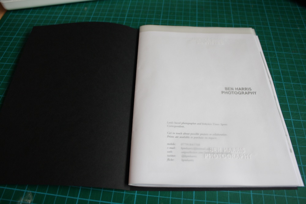

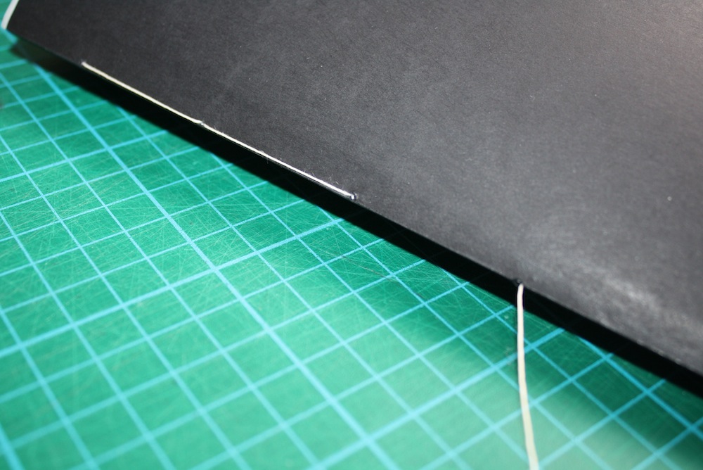

However the trace seemed to hold up quite well when bound and didn't leave any particualrly noticeable tears. It also provided a surface on which to use the embossing press I bought for Bens identity. The emboss on the trace is very prominent and I think this could be a good place for it, having the embossed name on the trace almost like a water mark.


Although the pages are half blocked by the trace it means that the image preserves much better and also gives the book another element of interactivity which might work well by making the process of looking through the book more memorable.


The finished mock up with black covers, pamphlet stitched with white thread to contrast the cover. There will be no detail on the front cover, just on the inside pages. It is also the same format that Ben shoots in so that the images are evenly spaced on the pages. Each spread will have a trace sheet between to prevent images transferring ink to one another. I think this format works nicely, much better than the previous example, and the trace layers give a much weightier feel whilst having a practical application.
Brief 2 - Ben Harris Studio signage


Variations in layout for possible signage for Ben Harris' studio. Much prefer the simpler layout of the final variant. Below it is in the same grey as the web elements of his identity.


The sign printed and in situe on grey stock.
Brief 2 - Twitter Background
Tried creating a backdrop for the twitter with Bens logo in the corner as it is on the website. It is not responsive, so on different screen sizes it does not change, however I think it is a nice touch to the overall web presence.

.png)
Picking the grey from Ben's website and bringing it to his twitter background in order to get some visual consistency across Bens professional networks.

.png)
Picking the grey from Ben's website and bringing it to his twitter background in order to get some visual consistency across Bens professional networks.
Subscribe to:
Posts (Atom)